Why choose vidaXL?

24/7 deals
Find the best deals & discounted products every day at vidaXL!

Free delivery on all products
Don’t worry about delivery costs; get all products delivered to your home for free.

Cash on Delivery
At vidaXL, you don’t have to wait to buy your favourite product – get it now & pay on delivery!

Get discounts with vidaXL+
Opt in with your account today and watch your vidaXL+ points grow. The more you shop, the bigger the discounts you can unlock!
 English
 العربية


.png?sw=192)

.png?sw=192)

.png?sw=192)
.png?sw=192)

.png?sw=192)


The ABC of accessorising with colour
Interior · 18. June 2022
A splash of colour draws the eye, changes the mood, and emphasises certain details in any space. Even so, don't we all seem a little afraid of strong hues when choosing the interior colour design for our homes? Fortunately, we are here to tell you that learning how to match colours in interior design for a balanced look is quite easy.
We've got all the secrets for accessorising with colour, from choosing the right interior colour combination to ideas on how to use the colour wheel in interior design. While there are important rules to follow, one of the most fun parts of decorating is playing with colour. Let us get started with the ABCs of colour accessorising to create a consistent, yet lively space that reflects your individuality.


Interior design colour rules: do I need a colour scheme for the whole house?
The answer to this question is yes and no, depending on how you imagine your space. While putting out the basic interior design colour rules, we want to encourage you to also use your creativity and sense of style. We'll go over three of the most important rules to remember when learning how to use a colour wheel for interior design.

1. The complementary colour scheme
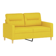
A complementary colour scheme consists of two hues on the colour wheel that oppose each other. The three traditional colour combinations to start with are: red and green, yellow and purple, or orange and blue. These colour combos are meant to be used as accent hues, so you may want to add neutrals for balance.

2. The 60-30-10 colour rule
According to this rule, the dominant colour should account for 60% of the space, the secondary colour for 30%, and the accent colour for 10%. Enough with the math; here's how to apply this rule:
- 60% reflects the room's overall colour - the background. This is the colour you'll use for most of the walls, as well as major furniture pieces like your sofa and larger decorations such as the rug.
- 30% is your secondary colour, which adds depth while allowing your main hue to stand out. We recommend using this colour for less obvious furniture like chairs and side tables, as well as curtains.
- The remaining 10% is your accent colour. Choosing this tone is the most fun of them all because you can add splashes of colour to give the space a distinct feel. Use it lightly in cushions, throws, and other ornamental items. Furthermore, you'll have the flexibility to rearrange or replace these elements as needed to keep the design fresh.


3. Mixing cool and warm colours
Warm colours include red, orange, yellow, and neutrals because they bring to mind images of warmth and brightness. If you want your living room (and kitchen) interior colour design to glow while still feeling cosy, these are excellent choices.
Blue, green, grey, and purple, on the other hand, are cold colours that are more subtle while inviting calmness into the space. As a result, we recommend that you use them in your bedroom or bathroom's interior colour design.

How to accessorise your home using interior colour schemes
Some of the most important interior colour design rules for your home are listed above. However, we believe that rules are supposed to be broken (on occasion), especially when it comes to colour matching in interior design. When learning how to match colours in interior design, there are several paths you can take:
- You might choose a colour scheme and stick to it throughout your home, changing only the focus by playing with different tones of the same colour family. For example, cooler shades are appropriate for a peaceful bedroom and reading nook, while warmer ones work better in a lively kitchen or around your entertainment centre. According to colour psychology, cool shades have a calming impact on us, helping us to distress and rest. Warm colours, on the other hand, have an energising effect, making us feel optimistic and lively.
- We also encourage you to take advantage of the wonderful neutrals. In interior colour design for your home, black adds a bit (or more) of drama to any corner and highlights key décor elements. White will always refresh the area and the furniture, giving it a more modern vibe. Grey and beige can be used to provide a blank canvas for your décor or to tone down vibrant features.
- TYou can pick the Pantone colour of the year 2022, the beautiful Very Peri, to create a space that feels contemporary. The bold and creative blue with violet undertones is both inspiring and soothing, and its dynamic presence adds depth. If an accent wall in Very Peri is too much for you, we propose incorporating it into your décor in little doses.

♥ Pro tip: Using books, memorabilia, and family photos to bring splashes of colour to a room is the simplest way to do so. Plants and fresh flowers are also essential in a welcoming and vibrant décor.